Thursday, December 18, 2014

Week 7 - Design

Title: Euphonium
Size: 10 by 8 inches 
This piece shows my euphonium in all it's glory.

I went about 20 minutes over the time limit with this piece, but I'm okay with that, because I really like how it turned out. I really had never before realized quite how much tubing there was on my instrument. I spent 50 minutes on outlining, and I still managed to miss five lines (that I've counted so far). ;)

For this assignment, we were supposed to find something in our home that we enjoyed the design of, draw it, and try to keep in mind how very many things in our homes had to be designed by someone. Architecture, furniture, dishes, electronics... the list goes on and on. Personally, though, I really would like to know who comes up with the designs for instruments. It's incredible how convoluted it seems, but then it plays music so easily. It's an interesting relationship, I think. All that effort to make it, just so that it takes less effort to use.

Anyway, It's been an interesting assignment. :D

Sunday, December 14, 2014

Week 6 - Watercolor Landscape

Title: Trees by the Lake
Size: 14 by 11 inches
This piece portrays a lake up in the mountains surrounded by trees, done in watercolor.

It was interesting to try and layer the paints to try and show a landscape. I'm not quite satisfied with the clouds or the mountains, but overall, I like how it turned out. I do like my trees though. :)

Week 6 - Watercolor Color Wheel


Title: Watercolor Wheel
Size: 8 by 8 inches
This piece shows the primary and secondary colors.

Red, yellow, and blue are the primary colors; and green, orange, and purple are the secondary colors. Any colors that are across from each other are complementary colors.

This little color wheel was fun and quick to make. It was interesting to try and get the colors to get the colors to blend right. :)

Tuesday, December 9, 2014

Week 6 - Watercolor Bug

Title: Spring Loaded
Size: 14 by 11 inches
This piece portrays a grasshopper perched on a piece of stone in watercolor.

This was really fun to do. It took quite a while, but I really enjoyed it. Sketching out the right proportions took a few tries, but I am satisfied that it looks like a grasshopper. Trying to color it in was entertaining too. At first I was like "Okay, this bit is brown, that next bit is... also brown... next, brownish orange...", but then I got more into it and was able to distinguish which colors should go where a little more.

I am almost certain I went overboard with the speckling, but what can I say? I love speckling... :D

Monday, December 8, 2014

Week 5 - Abstract Watercolor


Title: Lightsong Exclaims
Size: 11 by 14 inches
This piece uses watercolors and the abstract style to portray the emotions of a happy person. :)

For this piece, I just sat down with my sketchpad and paints, blasted Happy on repeat, and started playing with the paints. It was really fun to do a piece where I didn't have to worry about it looking like anything. I really like how it came out, even if it looks a bit like a melted easter egg. ;)

Wednesday, December 3, 2014

Week 5 - Self Portrait

Title: Self Portrait
Size: 6 by 8 inches
This piece is the result of my attempts to draw myself in my personal style.

I feel like this piece turned out okay. Not great, but not awful either. The problem with pen is, of course, that it can't be erased. So any errant lines are stuck in the picture. I could drone on for a few hours, complaining about the many things I wish I had done differently, but, instead, I shall endeavor to stay positive.

The girl in the picture looks sort of like me, so I'm going to call that a victory. 

Starting out, I didn't intend for this picture to turn out quite so brown, but now I rather like the sense of unity all the shades of brown lend to the piece. I tend to doodle cartoons, and my drawings are often populated with mini me's, but trying to draw myself in a more realistic manner was an interesting change. If nothing else, I had a lot of fun drawing it. :)

Sunday, November 30, 2014

Week 4 - Abstract Art

Title: Claiming the Winds
Size: 800x600 pixels
This piece uses the abstract style to portray a little of the freedom that the wind has.

For this assignment I used Pixlr. It was my first time, and it was pretty fun to experiment with all the different tools, and then try to figure out how to get them all to work together.

Unsurprisingly, this piece is based (loosely) on a scene in Words of Radiance. I used a mental image I got from the story, and tried to abstract-ify it so that it was utterly vague. :)

Tuesday, November 25, 2014

Week 3 - Human Sculpture

Title: Diluting the Day's Troubles
Size: the figure is 8 inches long
This piece portrays all the thoughts that can be rushing through your head as you kick back and relax.

Sunday, October 26, 2014

Week 9 - Art

Title: Windrunner
Size: 8 and 1/2 by 11 inches
This piece portrays my attempts to recreate the style of William Joyce while illustrating one of my favorite books (Words of Radiance).

For this week's drawing, I was supposed to draw something from my imagination. At first I thought that was overly vague, but it allows quite a bit of freedom. The problem was trying to decide exactly what from my imagination I wanted to draw. I finally decided on Kaladin and Syl. (I think I probably illustrate them too much). 

It occurred to me last week that there were quite a few parallels between Kaladin and Nightlight (from Guardians of Childhood), and so I decided to try illustrating Kal after the style of William Joyce. So Kaladin is drawn like Nightlight and Syl is drawn like the moonbeam.

I'm really happy with how they turned out! It was super fun to try and get the right blend between looking like either character. Also, the moonbeam's swirls of star dust translated quite nicely into a skirt, although drawing them was an interesting challenge. ;)

Overall, I think this picture was a success. I think that later, if I have time, I'd like to go back and add a background, but for right now, I'm pretty happy with this piece.

Sunday, October 19, 2014

Week 8 - Art (Part 2)


Title: One Point For You If You Can Guess What I Love
Size: 8 and 1/2 by 5 inches
This piece portrays how receding lines can be used in a one point perspective drawing.

Oh, I haven't done one point perspective in so long! Coming back to it feels like returning to a sport you haven't played in a while, and you just have to stretch and start playing. It really was fun to try and get all the letters to line up just right. :D

I know that anything involving straight lines really isn't one of my strong points, but it was certainly an adventure to try and get things to still look like themselves while still following the rules of perspective. I think my shading certainly could have been smoother, but I figure this picture was for practicing perspective, not shading. ;)

Week 8 - Art

Title: Growing Cliffside
Size: 4 by 8 inches
This piece portrays a Chinese painting of trees and mountains.

I'm not quite sure how I like this piece. It was fun to try and draw someone else's style of drawing, but I feel that I didn't quite capture it completely. I like how the picture turned out looking slightly abstract, but I still think the lines should have been a bit... crisper.

Monday, October 13, 2014

Week 7 - Art (Part 2)

Title: A Swirl of Pits and Stacked Grass
Size: 17 inches in diameter
This piece portrays the unity of nature.

This piece was especially fun to make because of the movement the materials created (for me). I couldn't just pick up a pencil and go. If I wanted straight lines, I had to go look for lines, grab them, bring them back, and repeat when I didn't get enough. One of the things I love about doing 3-D art is that, when I finish, what I remember is the movements of making it. 


When I think about a drawing I've done, I remember using my pencil: drawing the outline, shading the edges, or something like that. But when I think about making, for example, a pile of grass, I think about about picking the grass, slipping the pieces on top of each other, and seeing what my stack looked like from inside. That's one thing that always makes me at least a little sad when I finish a 3-D piece. The inside is gone, lost from human eyes. The feel of wet clay or the the excitement of getting two pieces to balance just right without falling over is gone once the piece has been fired or immortalized by photograph. It sometimes feels almost like the life has been drained out of it.


Anyway, I'm pretty happy with how this ended up. I think it looks pretty good, if I may say so myself. Of course, my mind, sculptures are all about the movement of creating them, so I really don't ever know quite how to respond when I finish a piece. ("Do I just let it sit there? On the shelf? ...But can't I do somthing with it?"). ;)

Friday, October 10, 2014

Art - week 7


Title: Fruit from Shinovar
Size: 8 by 9 inches
This piece portrays the texture of a strawberry.

Here is half an hour's worth of staring at fruit. I wasn't sure if I could spend the whole half hour on a single strawberry, but I somehow managed it. Hooray! These guys have way more texture than I thought, so it was interesting to try and show the idea of a strawberry's texture without going through grid art style and making every square centimeter exact.

This actually turned out way better than I expected. I wasn't quite sure how well the texture would end up, but it actually looks like a strawberry. Who would've guessed? My one problem was that the strawberry I was drawing from was really narrow. You may wonder how that would affect the drawing, but because it's so narrow, it almost looks like the shadow is part of the fruit itself.

For anyone wondering about the title, it's in reference to the Stormlight Archive, where strawberries only grow in a distant country called Shinovar. It's a bit random, but I've been trying to make my titles less direct, so calling the piece "A Strawberry" seemed a bit too straightforward to me. ;)

Monday, October 6, 2014

Week 6 - Art (Part 2)

Title: Megumi Wiley, Owl and Moth Logo
Size: 5 and 1/2 by 8 and 1/2 inches
This piece portrays my attempts at trying to make a logo and use negative space.

I think this turned out better than expected, but I still feel like I could have done a bit better. I feel like I may have sacrificed a more easily read "M" for an owl head that looks more like an owl head and less like a "M" (And the face shape is reminiscent of Magneto's helmet. Is that just me?). And the moth! I don't feel like quite I did it justice. In my sketches, it looked both more a moth and an "i". Oh well... Overall, though, I think it came out fairly well. You can tell that it's an owl, and my "W" looks like a "W". Hooray for that, I guess. :)

Saturday, October 4, 2014

Week 6 - Art

Title: Thinking Back a Few Years
Size: 11 by 8 and 1/2 inches
This drawing portrays a bit of what my old house was like. I haven't lived there in... What, 6, 7 years now? Weird. This piece tries to capture a bit of what I remember about living there.

My first weekly drawing with color!

This one I just wanted to try and show what I remember (You can read my prewriting here), so I made the lines a bit rounder, more carefree, and not as exact and perfect as I would otherwise try to capture. Memories (at least mine), are never exact, so I tried to play with reality a bit in this piece. Then I added some crayon for flavor. I love working in crayon. For this piece I was just filling in a few shapes with color, but seriously guys, crayons are fantastic. Also, the quick, textured strokes of color add another dimension of childishness for me. I rather like the way this all came together. I was a bit unsure about the style, but I think it turned out fine. :)

Week 5 - Art (Part 2)

Title: Agents of Shield
Size: 16 by 6 and 3/4 inches
This piece portrays the cast of Marvel's Agents of Shield (well, all but Skye and Ward. They're a work in progress.)

I decided I should probably put this up, even though my artist senses are screaming "NO! It's not finished yet!" I figured it will probably take a while to finish, so I should just post what I do have. Here you go.

What you are looking at is the result of around 20 hours of work. I'm quite proud of it. My favorite is agent Simmons (on the far left). The sizing of this turned out really weird, so it's on two pieces of paper. That's why there's a big shadow before the last 3 columns...

Hopefully I will get the rest of this finished soon. :D

Sunday, September 28, 2014

Chalk Sandy and Syl

I went to the MHA pizza party on Thursday. It was great! They had both chalk and sidewalks, so this was the result...
So this picture shows Sanderson Man Snoozie, a.k.a. Sandman, from William Joyce's Guardians of Childhood series and Sylphrena, from Brandon Sanderson's Way of Kings. These two are my very favorites to draw in chalk! I feel like chalk is the very best way to show Sandy's hair in all its twirly glory, and the pastel shades and translucent lines are ideal for portraying Syl.

These pieces are titled Dancing with the Winds and The Sandman.

Tuesday, September 23, 2014

Week 5 - Art

Title: My Laptop
Size: 11 by 8 and 1/2 inches
This piece portrays the laptop I do all my schoolwork on. :)

I'd never tried drawing a laptop before today. It was really interesting. In my mind, the use of straight lines almost made it seem that I was working with a completely different medium than other drawings I've done. The one thing that was particularly challenging was trying to get keyboard to be spaced right. I just kept thinking "I could fit an extra key right here..." ;)

Monday, September 22, 2014

Week 4 - Art (Part 2)


Title: Ladrian Peninsula
Size: 11 by 8 and 1/2 inches
This piece portrays my attempts at pulling together several different landforms.

This piece is colored in pencil with titles in pen.

Finally, my map is done. (sighs in relief) It was certainly an adventure to put together, seeing as designing landscapes is not one of my strong points. But even so, I think it turned out pretty nice.

When I was in the planning stages of this project, I decided that I didn't want to just label all of the landforms. So I added names to everything, which sort made the map feel more like a real place to me.
For anyone who was wondering, all the names come from Brandon Sanderson's Mistborn.

Wednesday, September 17, 2014

Week 4 - Art

Title: Blue Sketched Hands
Size: 11 by 8 and 1/2 inches
This piece portrays my right hand, being great. While drawing, I tried to capture a few of the different angles you can look at hands from.

This picture was done in pen.

When I read the assignment, my thought process was a bit like this:
"A hand? I've done hands before. I can do hands... But how can I make it less "generic hand drawing"? Well, I guess I can always use pen. That makes things more interesting to draw at least. Wait! Pen color was never specified in the criteria!  I'll do some blue hands. Yes, that's quite less generic than a pencil drawing..." (Cackles evilly)

So... yeah. Blue hands. Trying to draw all these hands made me realize though, negative space is essential. Sometimes I'd be trying to draw fingers or something, and it just wouldn't look right, but then once I started trying to draw around the shapes of the negative space, it started going much more nicely. :D

Sunday, September 14, 2014

Week 3 - Art (Part 2)

Title: Kaladin Stormblessed
Size: 8 and 1/2 by 11 inches
This (unfinished) piece portrays Kaladin, being awesome, as shown on the cover of Brandon Sanderson's Words of Radiance.

This picture was created using magazines, glue, and scissors.

More work from week 3! This piece isn't quite finished, but it needed to be turned in... so, expect to see a finished Kaladin Stormblessed sometime in the future! I really like how this collage is coming together. I feel that the clouds are coming together pretty well and Kal's uniform turned out great. Although, if this picture has one fault, it's that telling what object any given piece of paper belongs to is nearly impossible. Oh well!  (Hmm... also, taking 6 and 1/2 hours should probably count as a second fault. ;P )

Thursday, September 11, 2014

Week 3 - Art

Title: Impressions of Branches
Size: 8 and 1/2 by 11 inches
This picture portrays the idea of a tree, and how there are branches upon branches layered one on top of another.

This picture was done in pencil.

I rather like the way the branches ended up. When I started, I wasn't really sure what I was planning, after all, I could hardly draw each leaf individually and not take an outrageous amount of time. So I drew where the branches sat, then how the light hit them. And here's the result! 

Thursday, September 4, 2014

Week 1 - Art

Title: A Story
Size:  8 and 1/2 by 11 inches
This artwork portrays the way I feel while reading a good book. You just step out of reality and into another place.

This piece was outlined in pen and colored with colored pencil.

I'm quite happy with how this turned out. My one problem was that I forgot to take the background into account when I planned how to get this done in 2 hours. So I spent 45 extra minutes trying to get the hills drawn, colored, and looking right. :D

My favorite part is the antelope. Definitely the antelope.

Friday, August 29, 2014

Dragonfly Girl

I once wondered if I could draw a fairy that was more reminiscent of a dragonfly than a butterfly. This picture is the answer to that question. 

I finally remembered to use references for a drawing this time around, which really helped. Dragonfly wings are way bigger (proportionally) than I thought they were, and they have awesome stripe thingys on them. Fantastic, no? This picture was sketched in pencil, outlined in pen, and colored in colored pencil. It's about eight inches tall, and I was trying to portray a girl that made you think of a dragonfly. I really love the dragonfly-esque look I ended up with. :D

I think I've put up enough pictures now that you'll have a general idea of my style and what I draw. Also, feedback! I love hearing what all y'all think about my pictures, so please don't be afraid to leave comments. Thanks!

Why Can't Flamingos Be Griffins?

It's funny how many things begin with me sitting, bored, with a notebook of some sort in reach. Let me tell you a story: 

Once upon a time, I got bored and decided to draw a flamingo/griffin thing to stave off my boredom. I ended up with a funny looking thing that looked nothing like a griffin. He was trying so hard to pull off the whole "I'm an awesome looking griffin!" look, but he just couldn't pull it off. And so, the caption "Why can't flamingos be griffins?" was added.
The end.

This sketch took maybe five minutes (at most), but the bird's expression is enough to make me grin every time I see it. Technique wise, I think this piece isn't much good, but it cracks me up, and that makes it worth keeping around. Looking back, I see quite clearly why my dear bird can't be a griffin: A griffin is a lion/eagle mixture. This confused fellow seems to be a flamingo/antelope mixture. Oh well.

My bird is about nine inches tall, and drawn in graphite pencil. I find it funny that the third question I'm supposed to answer, "What were you trying to portray?", is usually answered by me shrugging and saying "I'm not entirely sure. I was really just messing around."

Brandon Sanderson Character Minis

Okay, so one day I was staring blankly at a piece of paper, wondering what to draw, and I ended up sketching Vin, a character from the novel Mistborn by Brandon Sanderson (my favorite author). After a moment I thought "What if I drew little, mini, adorable versions of people from a bunch of Brandon's novels!?" And so it began.

I ended up with Vin and Elend from Mistborn: the Final Empire, Vivenna and Siri from Warbreaker, 
Sarene from Elantris, and, of course, Shallan and Kaladin from The Way of Kings. Being the very smart and resourceful person that I am, I rushed through the sketches without even thinking to look in the books for descriptions of any of them.

But, overall, with me drawing from memory, I think that they ended up looking pretty nice. (Except for the hands. Why is it always the hands?!)

This drawing was sketched in pencil, outlined in pen, and colored in with colored pencils. Each character is about two inches tall.

Of course, if you've never read anything by Brandon Sanderson, I insist that you go find the nearest copy of anything penned by him. That man is a mad genius. He has some of the best fantasy books you will find anywhere.

Mythical Creature

What happens when your friend challenges you to draw a cross between a unicorn and a dragon?

...Well, this. I based the "dragon" part of the creature on an Asian dragon, rather than a European one, which made designing the creature a thousand times earlier. This drawing was sketched in pencil, outlined in pen, then colored in with colored pencils. It's around ten inches long. I'm quite happy with how it turned out, especially the fur/feathers/whatever-they-might-be. The blue green colored turned out even better than I imagined it would. :)

Spidey Sketch

Here's your friendly neighborhood Spiderman! What do you think, does he look amazing? Spectacular?

The other day I was bored, and there was a sketchbook, so this was the result. Halfway through I had that awkward moment when you realize that you don't know what Spiderman looks like. Thank goodness for Google!

My Spidey's about four inches tall, done in number two graphite pencil, and I was trying to portray Spiderman. I'd never actually drawn Spidey before, so I'm pretty satisfied with how it turned out. It's not my best work, but I think it turned out pretty well.

Sidewalk Chalk Sandy

Hello again, my fine friends! Here is an illustration I did of Sanderson man Snoozie, aka Sandman, from William Joyce's book series The Guardians of Childhood. Which I love to death, because they are FANTASTIC. (Seriously, go read them)

This Sandy's...what, three feet across? I did the sketch a week or two ago, and it rained the next day. Let's go with approximately three feet across. The material I used was sidewalk chalk (notice how he's conspicuously drawn in the shade, out of the summer sun). In this sketch, I was trying to portray Sandy, and how incredibly happy he is. Also, how happy his hair makes me. I mean, look at it! It's breathtaking. Anyway, I'm pretty satisfied with how it turned out. His hair was super fun to draw. It's seriously as fun to draw as look at, if not more.

Also, I highly recommend checking out the work of William Joyce. He's a talented artist and author.

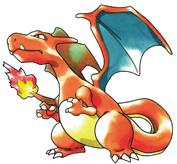
Charizard Pancake


Here's my first post! I normally don't do too much 3D art, but a while back I was making what I have dubbed "abstract art" pancakes, and I made a pancake that looks uncannily like the Pokemon Charizard! It was completely unintentional, but, hey! An amazing pancake is an amazing pancake, right?

Okay, so the size is about 3 inches in diameter; the materials I used were pancake batter, a griddle, a stove, and a spatula; and I was trying to portray... I'm not actually sure. It turned out as a Charizard, but when I was making it, I was just messing around, experimenting with pouring bits of batter onto the griddle at different times. :D

The Charizard illustration came from an article on Pokemon Wiki.